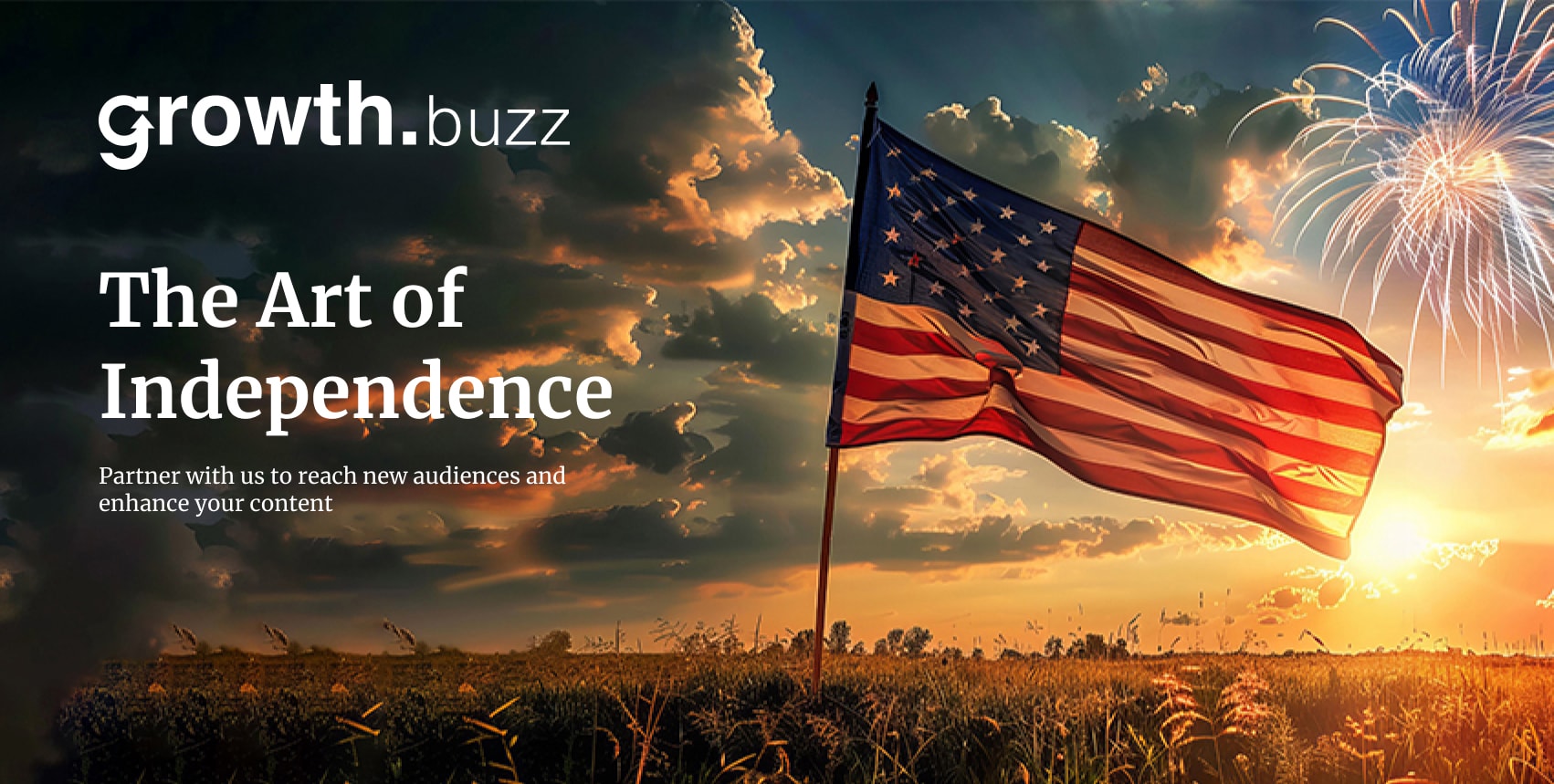
Magazine by AI & Human
Friday
May 10,2024
Preface
The graphic identity for Growth.Buzz is summarized in this brand book document. Adhering to these guidelines will maintain a strong brand identity and establish rules for the consistent implementation of brand elements.
In a rapidly evolving digital landscape, maintaining a cohesive and recognizable brand identity is crucial. This brand book serves as a comprehensive guide for designers, marketers, and all stakeholders involved in presenting Growth.Buzz to the world.
By following the outlined standards, we ensure that every visual representation of our brand is consistent, professional, and true to our core values.
Inside this document, you will find detailed instructions on the use of logos, color schemes, typography, and other essential elements of our visual identity.
These guidelines are designed to be flexible enough to allow creativity while providing a solid foundation for maintaining brand integrity.
Thank you for your commitment to upholding the Growth.Buzz brand. Together, we will build a strong, enduring presence in the market.
Brand Story
Vision
Growth.Buzz is a community platform for entrepreneurs and organizational leaders seeking insights on business growth, new technologies, and best practices. It connects members with growth leaders, features emerging businesses, and highlights often-overlooked entrepreneurs and industry pioneers..
Values
At Growth.Buzz, our values drive everything we do. We believe in innovation, integrity, and excellence. These principles guide our actions and decisions, ensuring that we consistently deliver valuable content to our readers.
Promise
Our brand promise is to empower businesses to grow by providing cutting-edge insights and strategies. We are dedicated to helping our audience achieve their goals through expert advice and unparalleled support.
Product
Growth.Buzz offers a variety of tools and resources designed to foster business growth. From market analysis to strategic planning, our content is engineered to provide actionable insights that drive success.
Market Position
Growth.Buzz positions itself as a leader in the business growth industry. We differentiate ourselves through our commitment to innovation, our deep understanding of market dynamics, and our unwavering dedication to our readers' success. Our market position is strengthened by our reputation for delivering high-quality content that exceeds expectations.
Tone
The tone of our blog is confident, knowledgeable, and approachable. We aim to inspire and engage our readers by delivering content that is both informative and easy to understand. Whether we are addressing entrepreneurs, marketers, or business enthusiasts, our tone remains consistent and true to our brand values.
Style
Our visual style is modern, clean, and professional. We use a consistent color palette, typography, and imagery to create a cohesive look and feel across all our blog pages. This attention to detail helps to reinforce our brand identity and makes our communications instantly recognizable.

Contributor Guidelines
As a contributor to Growth.Buzz, your role is pivotal in maintaining our brand’s integrity. Inside this document, you will find detailed instructions on the use of logos, color schemes, typography, and other essential elements of our visual identity.
These guidelines are designed to be flexible enough to allow creativity while providing a solid foundation for maintaining brand integrity. Your adherence to these guidelines will help us create a unified and professional appearance across all content.
Core Brand Elements
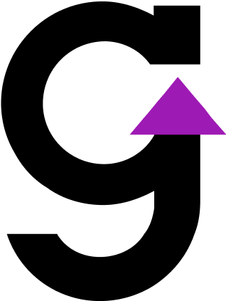
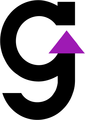
Flagship Logo
Growth.Buzz is the flagship online platform for business growth insights and strategies.
Its unique signature is the flagship logo, which should be used on all branded items.
Logo on Background
The Growth.Buzz logo should be used as indicated in the pictures. If the logo is used on top of a photo, it should be used in its negative form with the red flame icon, provided contrast allows it. Use the white logo in combination with the red background, and the black logo version only when necessary.
- Positive Logo
- Negative Logo
- Monochromatic / White version
- Monochromatic / Black version

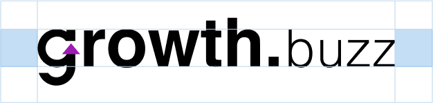
Clearance
Always keep a minimum safe area around the Growth.Buzz logo to maintain visual clarity and provide maximum impact.
The clearance area is defined by the cap height of the logotype. Photos, text, and graphic elements should not overlap this area.
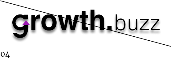
Misuse
- Do not distort the logo
- Do not cut the logo.
- Do not use gradients on the logo.
- Do not apply any effect on the logo.
- Do not change the color of the logo.
- Do not change the proportion of the logo.
The Growth.Buzz logo should be used as indicated in the pictures. If the logo is used on top of a photo, it should be used in its negative form with the red flame icon, provided contrast allows it. Use the white logo in combination with the red background, and the black logo version only when necessary.
Scale
Ensure readability and legibility of the flagship logo at all sizes.
Minimum width for print: 1 inch
Minimum width for digital: 180 px

Arrow g Icon
The Arrow g icon is a secondary brand element of Growth.Buzz. It represents dynamic growth and is impactful in and of itself. It has strong brand recognition and deep anchors in the business growth community.
Beyond digital applications, such as social and mobile icons, where the Arrow g icon can stand on its own, it should always be used in combination with the flagship logo.
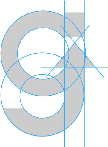
Arrow g Icon Construction
The Arrow g icon has been carefully redrawn based on circular shapes to work well at small sizes in digital environments.
Please do not alter the icon in any way.
Icon Scale
Ensure readability and legibility of the Growth.Buzz icon when used as stand alone symbol.
Minimum width for print: 0.3 inch
Minimum width for digital: 180 px
Logo on Background
The Growth.Buzz icon should be used as indicated in the pictures. If the icon is used on top of a photo, it should be used in its negative form with the red Arrow g icon, provided contrast allows it. Use the white icon in combination with the red background, and the black icon version only when necessary.
- Positive Logo
- Negative Logo
- Monochromatic / White version
- Monochromatic / Black version
Color
Primary Colors
Purple
Dark Orchid Purple
CMYK 60 / 87 / 0 / 0
RGB 158 / 26 / 180
Hex #9E1AB4
Black
Black
CMYK 0 / 0 / 0 / 100
RGB 0 / 0 / 0
Hex #00000
White
White
CMYK 0 / 0 / 0 / 0
RGB 255 / 255 / 255
Hex #FFFFFF
Secondary Colors
Dark Blue
Yankees Blue
RGB 40 / 46 / 71
Hex #282E47
Soft Grey
Anti-Flash White
RGB 243 / 243 / 245
Hex #F3F3F5
Beige
Cultured
RGB 249 / 247 / 242
Hex #F9F7F2
Neutrals
Grey 45
RGB 123 / 123 / 123
Hex #7B7B7B
Grey 38
RGB 159 / 159 / 159
Hex #9F9F9F
Grey 10
RGB 229 / 229 / 229
Hex #E5E5E5
Grey 5
RGB 242 / 242 / 242
Hex #F2F2F2
Typography
Typefaces
Typefaces (Sans-Serif)
Helvetica is a modern, editorial sans-serif font, chosen to be the primary headline display font for Growth.Buzz. Please note that for the website and other digital applications,
some weights of Helvetica may get replaced by the Google font Merriweather due to licensing costs.
Typefaces (Serif)
Helvetica is a widely recognized sans-serif typeface, choosen to be the primary sans-serif display font for The Indian Express. Please note that for the website and other digital applications,
some weights of Helvetica get replaced by the Google font Open Sans because of licensing costs.

Helvetica, originally Neue Haas Grotesk, was created in 1957 by Max Miedinger and Eduard Hoffmann at the Haas Type Foundry. Renamed in 1960, it quickly gained popularity for its clean and versatile design. Extensively used in advertising, signage,
and branding, Helvetica became a design icon. Highlighted in the 2007 documentary "Helvetica," it has been updated to Neue Helvetica in 1983 and Helvetica Now in 2019 to adapt to modern media.
Type System
Helvetica, a widely recognized sans-serif typeface, is chosen to be the primary sans-serif display font for The Indian Express. Celebrated for its clean and modern appearance, Helvetica offers clear and readable letterforms with a balanced x-height and open counters, ensuring excellent legibility across various sizes and resolutions.
Available in multiple weights and styles, including Regular, Light, Bold, and Italic, Helvetica enhances the readability and visual appeal of digital content. Due to licensing costs, some weights of Helvetica may be replaced by the Google font Open Sans for the website and other digital applications.

Web type
The Merriweather font is available on Google Fonts, making it a viable alternative for digital applications where licensing costs for proprietary fonts are prohibitive.
You can find and use Merriweather from Google Fonts by visiting their website and searching for "Merriweather.
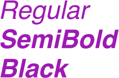
Regular
SemiBold
Black
Regular
SemiBold
Black
Merriweather is a serif typeface designed by Eben Sorkin, known for its sturdy and modern appearance tailored for on-screen readability. With a generous x-height and slightly condensed letterforms, Merriweather ensures excellent legibility even at smaller sizes.
Its versatility in various weights and styles, including Regular, Bold, Italic, and Bold Italic, makes it a popular choice for digital publishing and web typography, offering both clarity and elegance in its design.
Type System
Merriweather is a modern, editorial serif font, chosen to be the primary serif headline display font for The Indian Express. Known for its sturdy and modern appearance tailored for on-screen readability, Merriweather ensures excellent legibility even at smaller sizes with its generous x-height and slightly condensed letterforms.
It comes in various weights and styles, including Regular, Bold, Italic, and Bold Italic, making it versatile for digital publishing and web typography. However, due to licensing costs, some weights of Merriweather may be replaced by the Google font PT Serif for the website and other digital applications.
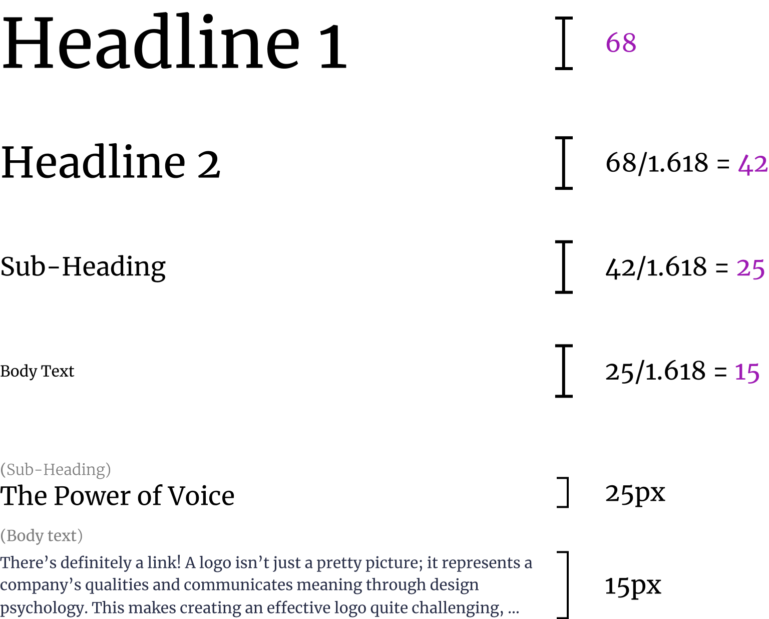
Golden ratio font size
Keep Dividing by 1.618 till you find the perfect balance, don't forget to round of the values

Print Application
Collateral
Business card exploration back and front
Collateral
Explore our greeting cards with an Up Arrow Icon
Collateral
Letterhead exploration with pen stamp embossed
Collateral
The Arrow g icon can be extracted from the flagship logo for specific merchandise articles.
Collateral
The Arrow g icon can be extracted from the flagship icon for specific merchandise articles.
Digital Application
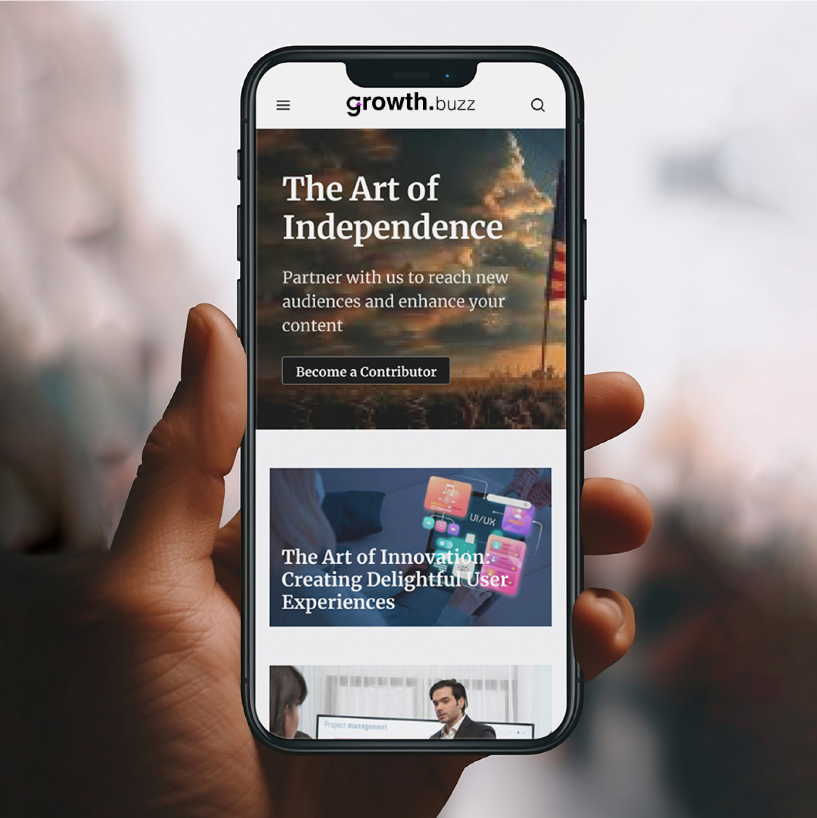
Website
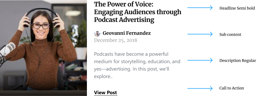
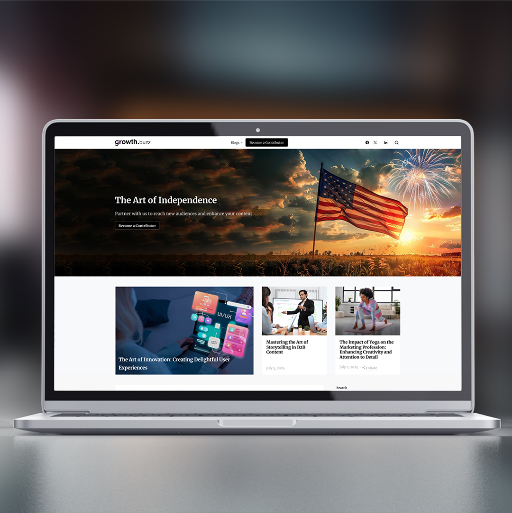
Homepage design with main hero area.
Website
Homepage design with main hero area.
Logo Download Files
Growth.buzz Wordmark logo
The Growth.buzz wordmark logo is available in 5 variations, please see the the brand guidelines for usage.

JPG
PNG
SVG
AI
EPS
Growth.buzz Wordmark with tagline logo
The Growth.buzz wordmark with tagline logo is available in 5 variations, please see the the brand guidelines for usage.
JPG
PNG
SVG
AI
EPS
Growth.buzz Logo Symbols
The Growth.buzz Logo Symbols is available in 5 variations, please see the the brand guidelines for usage.
JPG
PNG
SVG
AI
EPS
Social Media
Facebook
Social mark icon applied to Facebook feed.
Banner sized
Cover Image - 820 x 312
Landscape poster - 1200 x 630
Poster - 1080 x 1080
X (Twitter)
Social mark icon applied to Twitter feed.
Banner sized
Cover Image - 1500 x 3500
Landscape poster - 1200 x 630
Poster - 1080 x 1080
Linkedin
Social mark icon applied to Linkedin feed.
Banner sized
Cover Image - 1500 x 3500
Poster - 1080 x 1080
Landscape poster - 1200 x 630
Website banners
Website banner sizes can vary depending on the specific layout and design of your website.
Banner sized
Latest Article - 650 x 404
Previous Article - 305 x 229
Article Inner Banner - 820 x 462
Hero Banner - 1920 x 600